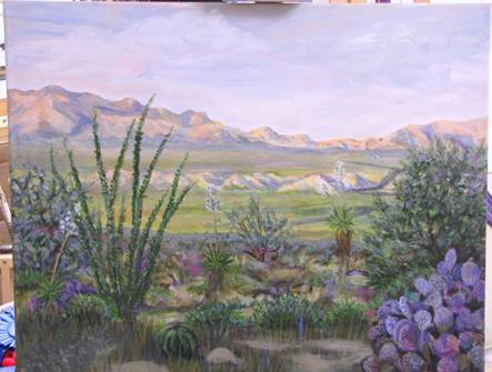
Chris's Corkboard
This is the painting I am struggling with.
It’s
not quite finished. It’s my first
attempt to paint my desert home.
It’s my first attempt to do a serious painting in acrylics. It’s my first attempt to do a
“backwards” landscape with a bluish foreground and a yellowish
background. It’s driving me crazy!
The
situation:
The sun has
gone down behind the Whetstone Mts behind me, putting
the foreground in deep shadow, but sunlight through an intermountain gap is
still brightly illuminating the valley and the Dragoon Mts
with peach-colored light. Sunset is not
far enough advanced to color the northeastern sky though.
It’s
the monsoon season and the desert is green (I started this in early September,
sigh). The greenest desert greens are
nothing like the vivid greens of wetter climes, though. The valley bottom has irrigated farm fields
which are much greener than the desert green.
This
particular desert consists of a scrub-tree open forest (mostly mesquites and
cat-claw acacias) with an understory of desert clump grasses, scattered cacti,
and patches of bare ground. The bare
ground is a pale golden color. There are
2 mesas dropping down to the valley floor.
You are standing on the edge of one mesa. About 10 feet below the next lower mesa
stretches away until it drops to the valley.
Once you get a little way away, you see mainly the tops of the scrub
forest. The bare ground, grasses, and
cacti are lost to view.
My problems:
I am having a
devil of a time capturing the desert colors.
They are all so extremely unsaturated!
I started by sketching the scene and making careful note of the
colors. Then the following morning I
laid in the colors on the painting.
Waited for 5 PM to roll around again… ohmigod,
the colors are ALL WRONG! What I
remembered was nothing like what they really are. Over the next umpty
ump days, working just from 5 to 5:30, I struggled to get the colors right
without putting any detail at all into the painting yet. Then once the light was gone, I would wait
for the following daylight to assess what I had done. Couldn’t really assess my work at 5:30
when I finished painting, because the ambient light was colored and it was also
getting kinda darkish. The mountains as originally painted
reproduced the sunset glow nicely; BUT, they would not lay back into the
distance. So I altered the perceived
color to make the peach softer and the shadows lighter and less crisp. That’s not how it really looks but at
least it made the painting work a little better. How can I both reproduce the strong crisp
contrasts of sidelit desert
mountains, and have them look far away?
Any ideas?
The color of
the far mesas, above the bluffs, is currently painted richer and more varied
than in life but I just don’t seem to have the skill to mix the extremely
subtle shade of kinda greenish that is actually there. In life, you are seeing faraway tops of scrub
forest on those mesas. Not that it looks
like that in my painting, the texture is missing. At least the colors I used made the picture
prettier… when
I went too drab, it was really DRAB!
I’m beginning to think, it only looks green because you remember
how very non-green it was during the rest of the year. I want to get that “Wow, the desert is
green!” feeling while still staying true to its almost-not-there
greenness but I haven’t managed it.
Also, the far mesas should look farther away than the valley floor and I
don’t think they do. How do I
fix??
The shadowed
foreground has also been giving me fits.
Remember I said the local dirt is pale golden. When you look only at the real-life
foreground, the dirt still looks pretty golden.
But when you raise your eyes so you see the sunlit colors too, your
peripheral vision reads the dirt color as off-gray, not yellow. Since the subject of this painting is the
sunlit mountains not the shadowy foreground, I tried to work in a grayish shade
that still looked like golden dirt. At
one time, I went too gray and it started looking like a snow scene. Sigh.
The shadowed
green stuff in the foreground looks like a bluish green when seen against the
peach background. At first I painted the
trees, small brush, and cacti bluish green.
The following day I could clearly see it was WAY too bluish green! Way too saturated, and too
light, too. I had several
go-rounds of repainting in different colors, none of which worked. I am finally pretty happy with the acacia on
the right and the solution was to heavily glaze over about 50% of the foliage
with neutral gray and Payne’s gray.
The mesquite on the left needed to be paler than the acacia for
compositional purposes, and I slopped a lot of neutral gray on it. Color kinda works
now but is a little blue -- and the lacy look to the foliage has gone. How the heck do you take a tree with pale
unsaturated yellowish-green leaves, put it into blue shadow, then
show it the way it looks when seen against a peachy background? I have consistently been having trouble with
colors because what looks a lot lighter, brighter and more intense when you
focus on them becomes darker and grayer when you focus on the valley.
The purple
prickly pear in the right foreground wasn’t really there. I added it because I thought a punch of
purple would look good. (Note that the
camera made the prickly pear a lot bluer than it is in the painting; it’s
really more of a purple/blue/maroon medley.)
BUT – the latest copy of Southwest Art came out and the cover
featured a painting with a similar shadowed foreground and sunset-lit
background. Man that artist handled it
better than I am doing! I was so
impressed, and studied his other works shown in the feature article. Hmmmm! He doesn’t put foregrounds in at all
when the focus is actually the background!
Now I’m wondering if I shouldn’t have left that top mesa out
completely and started the painting on the middle mesa, with nothing seen
really up close. What do you think? Should I have left the prickly pear out
completely? Foreground is not finished
but I had planned to put in a barrel cactus and a rock or two… because I
HAVE to have a foreground, right? Well
now I’m thinking maybe not. What
do you guys think?
Incidentally,
that artist handled the light conditions by punching up the sunlit trees to
bright orange, and painting the shadowed trees as a big dark gray blob with
only the slightest indication of tree branches, no detail at all and no worries
about the bare trees actually being brownish.
It came off wonderfully well! But
his Midwestern woods are different than my desert and I don’t think I
could have gotten away with having the whole foreground that dark. Maybe I should have painted that closer,
shadowed desert all in tints of Payne’s gray though instead of trying to
color things the way my eyes saw them.
Sure worked for him.
Lastly,
I’m not enamored of the composition.
What would you do to give it more movement, without occluding the valley
and the far mountains?
 Email me